
Effective data visualization is the primary building block of almost all great infographics. But it’s not the only element an infographic can include. From illustrations and photographs to icons and timelines, infographics have a wealth of resources at their disposal when it comes time to tell a story.
(Still not sure how to tell the difference between data visualization and infographics? Ask your data visualization design service provider, or check out our article on how to tell them apart.)
But for this post, we wanted to highlight just a few of the infographics that are delivering real value to their audiences by incorporating fantastic and unusual data visualizations to enhance their underlying message. Let these examples serve as an inspiration to you the next time you kick off a visual communication project.
1. A Visualization of Train Speed

You don’t need to read Italian to appreciate the elegance of the data visualization in this infographic by Francesco Franchi. Not only do we learn the relative speeds of these trains broken down by geographical location; we can also glean extra information through color coding — for instance, whether a train line is under construction.
These many layers of information are laid out clearly and cleanly, making it easy for the reader to engage with whatever data points are most relevant or interesting to them.
2. An Infographic That Rides the Data Visualization Wave

One thing we love to see is effective data visualization that visually embodies a central, unifying metaphor. The infographic above likens a series of global mergers and acquisitions to a “wave” — and the metaphor takes off from there.
A bar chart transforms into that very wave, while small dolphins are sized relative to the data they’re representing. A bird draws a line chart across the sky to round out the scene.
If you want your infographics to tell self-contained narratives, ask your design service how they can ensure that your data visualization is fully tied, thematically and stylistically, to your infographic design as a whole.
 3. An Inventive Approach
The mini-infographic shown at right is one of a series that visualize the 2013 TIME Invention Poll.
Like most infographics, it aims to deliver just a few data points at a time. This way, audiences can quickly glean the primary information it’s delivering — then, if they like, choose to share that information far and wide on social and other channels.
What’s unusual about this data visualization is the way it visualizes poll data with relative bubble size. This type of data visualization is often referred to as a proportional area chart. (For a fantastic resource on the different types of data viz and what they’re called, check out the Data Visualisation Catalogue.)
The organization of data in this infographic allows us to quickly notice outliers, many of which — including Sweden and Singapore — are called out specifically, with more data offered on those outliers.
4. An Elegant Bar Graph
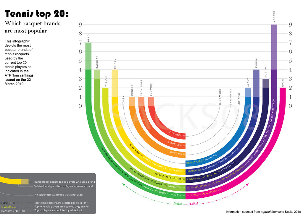
The bar graph above allows us to quickly see which tennis racquet brands are most popular, and compare trends between male and female players. If we want to dive in deeper, we can learn which specific players use each brand.
The goal of any strong data visualization or infographic should be to make it easy to learn and notice trends. Here, it’s immediately clear that there are some stark differences in racquet brand preference between male and female players. A tennis enthusiast could use this information to quickly decide which racquet brand might be right for them.
Because this is essentially a single, standalone graph, a data visualization design service would normally call it a mini-infographic. These are perfect for sharing on social media to tease a longer infographic or encourage engagement and sharing.
 5. A Brief Visualization of Time
In this infographic magazine spread, a simple chart visualizes the proportion of time each narrator controls the audiobook version of George Saunders’s Lincoln in the Bardo.
In order to visualize this, we used a Gantt chart — a kind of bar chart that’s typically used to outline the schedule for a project. This data visualization style nonetheless translated perfectly to the context at hand.
It represents a huge volume of data in a very clean, minimalistic way — and captures the tone of the book in the process.


Комментариев нет:
Отправить комментарий